Bonus lessons are optional.
Often it helps to see what data looks like. Python has a bunch o' plotting libraries.
The goal
Say you have some times for the goathalon. Here's part of it.
- Goat,Running,Swimming
- Roderick,90.77,93.58
- Junie,80.1,79.03
- Bea,86.04,89.8
- Rodney,82.43,83.98
- Weldon,86.16,88.22
- Del,94.71,95.56
- Charissa,90.28,89.99
- Gail,89.08,85.32
- ...
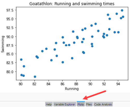
Let's make a chart like this:

It will show in the Plots tab in Spyder.
Each point is the time pair for one goat. For example, Roderick's dot is at 90.77 on the x axis (running time), and 93.58 on y (swimming time).
We'll use the Pyplot module of Matplotlib, a popular library. It comes with Spyder, so you don't need to install anything.
Pyplot has the method scatter, which will create the chart. So, what does scatter want? Here's code from a tutorial:
- import matplotlib.pyplot as plt
- price = [2.50, 1.23, 4.02, 3.25, 5.00, 4.40]
- sales_per_day = [34, 62, 49, 22, 13, 19]
- plt.scatter(price, sales_per_day)
- plt.show()
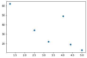
scatter takes two lists, and makes a plot. Here's what this code draws:

The first point is at (2.5, 34), the first value from each list. You can see it on the chart. The second is at (1.23, 62), and so on.
So in...
- plt.scatter(price, sales_per_day)
... the first list is each point's value on the x axis, and the second is each point's value on y.

Ethan
So, each list should have the same number of items?
Aye, that's true.
For our goaty plot, the code will include:
- plt.scatter(running, swimming)
We need two lists, one of running times, and the other of swimming times.
Data prep
We have a plotting method (scatter) that can do the job. But, it needs data in a specific format. So we'll write code to take the data in the format we have (a list of dictionaries), and create variables with the data in the format scatter wants (two lists).
This is a common task for data analysts.
Our data is:
- Goat,Running,Swimming
- Roderick,90.77,93.58
- Junie,80.1,79.03
- Bea,86.04,89.8
- Rodney,82.43,83.98
- Weldon,86.16,88.22
- Del,94.71,95.56
- Charissa,90.28,89.99
- Gail,89.08,85.32
- ...
We can make the lists by:
- Use
read_csv_data_setto read a list of dictionaries. - Make two MT lists.
- Loop over the goat records. For each one, put the running value in one list, and swimming in the other.
Here's some code to start with.
- import csv
- import matplotlib.pyplot as plt
- def read_csv_data_set(file_name):
- ...
- return data_set
- # Read the CSV file, and make a list of dictionaries.
- goatathlon_data_set = read_csv_data_set('goatathlon.csv')
- # Make a couple MT lists.
- running = []
- swimming = []
- # Loop over the records.
- for goat_record in goatathlon_data_set:
- # For the current record, add the running value to one of the new lists.
- running.append(float(goat_record['Running']))
- # Put swimming into the other one.
- swimming.append(float(goat_record['Swimming']))
- # Draw the chart.
- plt.scatter(running, swimming)
- plt.title('Goatathlon: Running and swimming times')
- plt.xlabel('Running')
- plt.ylabel('Swimming')
- plt.show()
Don't forget to use float (lines 16 and 18), since all the values in the list of dictionaries are strings.
Run the code, and you get:

Looks like swimming and running times are correlated. A goat who can run fast can swim fast as well.
Summary
- Python has a bunch o' plotting libraries.
- Pyplot's
scattermethod creates a scatter diagram. scattertakes two lists, and makes a plot.- We write code to take the data in the format we have (a list of dictionaries), and create variables with the data in the format
scatterwants (two lists).
Exercise
Curiosity vs GPA
Download this data file. Here's a sample:
- "Goat","Curiosity","GPA"
- "Roderick ",3.0,1.9
- "Junie ",1.7,2.1
- "Rodney ",4.6,3.0
- "Weldon ",2.2,1.8
The fields are:
- Goat: cannot be MT.
- Curiosity: float from 0 to 5.
- GPA: float from 0 to 4.
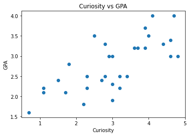
Make a plot like this, but only for valid records.

Output